Responsive Web Application & Mobile App
Connected Health, Made Simple
Client
Services
- UX design,
- UI design,
- API Development,
- Web Application,
- Hardware integrations,
- Mobile App Development
00 / Overview
Rooted in elite sport, research and innovation, Hero Wellbeing exists to help create healthy and happy communities. One unique human at a time. They offer a blended digital and in-person approach to deliver a holistic wellbeing programme. Hero came to SSG to completely overhaul their digital service Hero Navigator, which allows individuals and businesses to progress against goals including sleep, movement, nutrition and mindfulness using wearable technologies.
01 / Challenge
Originally founded in 2017, by 2020 Hero was delivering its product to companies in different industries, from Premier League football clubs to large corporates such as Vodafone and their staff all around the world. The existing Navigator platform had been built by various development agencies and had amassed a lot of technical debt, performance issues and design inconsistency. We were initially tasked with building Hero’s mobile app from scratch; Using the existing Web App as a blueprint for the desired IA, features and general functionality. This however was a significant challenge with the API in an incomplete state and the Web App in need of a UX and UI rethink. After presenting our creative for the mobile app, the client requested that we give the Web App a facelift inline with the new design language and also review the form & function of the Dashboard, as we had been able to demonstrate better ways of exposing core functionality to the end user in the mobile app designs. This project was made all the more challenging by ambitious deadlines, put in place to support Hero’s new client acquisitions.
01 / Challenge
Identifying the problems
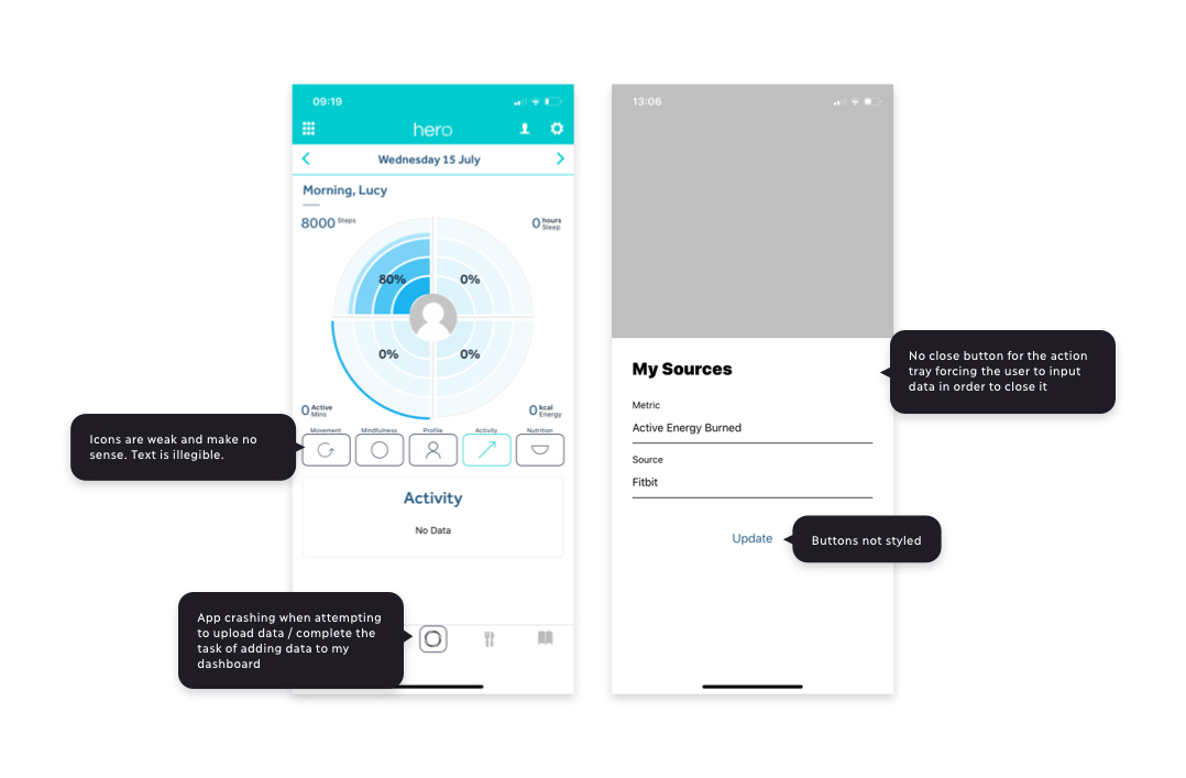
The Hero Navigator mobile and webs app suffered from a number of core issues: 1. Undesirable look and feel. Hero’s existing apps lacked the feeling of quality that Hero wanted for their users: A high end slick interface for the wellbeing sector. 2. Consistency. There were glaring UI inconsistencies across Hero’s digital properties such as conflicting fonts, palettes, UI components and navigation patterns. 3. Hierarchy. The information architecture was cluttered and unorganized making it feel more complex than it needed to be. There were core features and unnecessary personalisation features that had very little value in reality. 4. Bugs. The web app had not been built for scale and needed to be significantly refactored before we could progress the mobile app development. All the digital properties rely on a stable API so not having this stability is terminal for a company with this technology as its centrepiece. Our goal was to improve these aspects of Hero’s digital platforms without having to completely rebuild existing product features where possible.
02 / Solution
We kicked off with a super fast design sprint, reviewing all of Hero’s existing digital properties and used the findings to inform the design of the new mobile app. Once we’d implemented the new design for the mobile app, which was a high priority for the client, the redesign would be fed into their other digital properties including the Hero Navigator web platform.
02 / Solution
Users & Audience
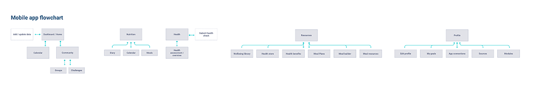
The app had two types of user, including organisation leaders who create challenges for their organisation. They also get access to real time data and insights to measure and further support the wellbeing of their staff. The second user type was company individuals, who can track their health metrics, explore wellbeing tools and resources and set personalised goals. All of Hero’s KPI’s and engagement with employees is driven by the app. These data insights help to support employee wellbeing with real measurable ROI so it was important to improve the overall user experience. Once we’d established the different user types of the platform, we simplified the information architecture and user journeys by cutting out unnecessary pages from the IA and main navigation. The app also needed to be versatile enough to allow it to be a custom platform for an organisation or on an individual basis. From a branded registration page through to having an entirely custom branded app. The solutions and products also had to be customisable to suit user requirements by removing modules that they don’t require or creating new modules just for them.
What we did
03 / UI Redesign
Old mobile app
03 / UI Redesign
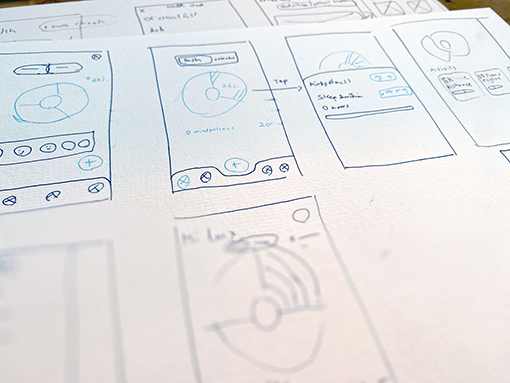
Sketching and Whiteboarding
We held several virtual whiteboarding sessions with key stakeholders in order to rapidly iterate on designs and address the issues we found within the existing mobile app.
What we did
03 / UI Redesign
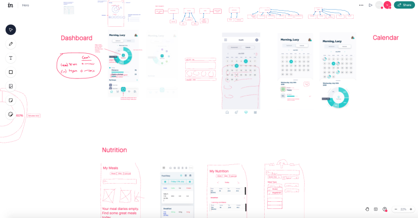
Virtual Whiteboarding
03 / UI Redesign
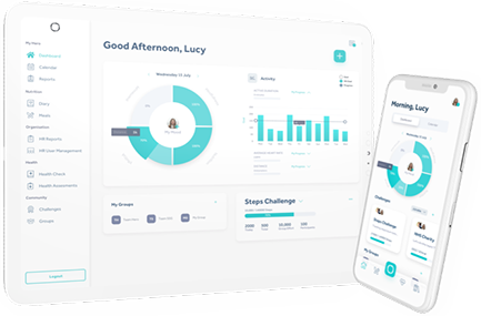
Mobile Dashboard
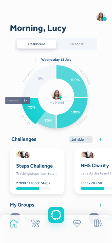
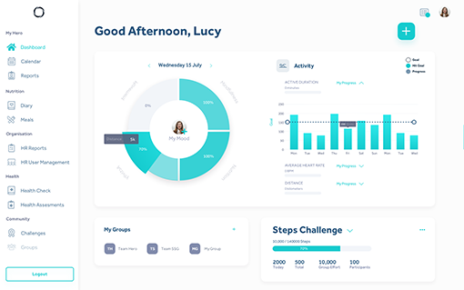
We redesigned the primary data visualisation on the dashboard to clearly indicate to users the component parts of holistic wellbeing and how they were progressing towards their daily goals. We also chose to revamp the IA and set about surfacing the most meaningful content to the user on the dashboard such as Current Challenges and Groups.
03 / UI Redesign
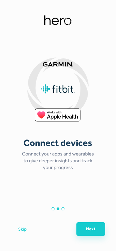
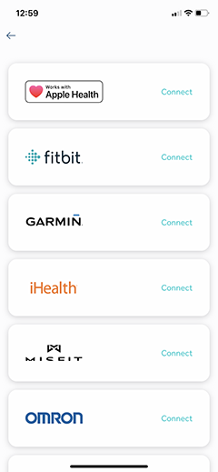
HealthKit & Google Fit Integrations
One of the biggest challenges with the project was integrations with the phone health data as well as integrations with other wearables via a 3rd party called Validic. Hero want people to take their health and wellbeing seriously and as a result, the platform allows you to connect all manner of smart devices to measure simple things like your steps, to very complex things like your glucose levels from medical devices.
03 / UI Redesign
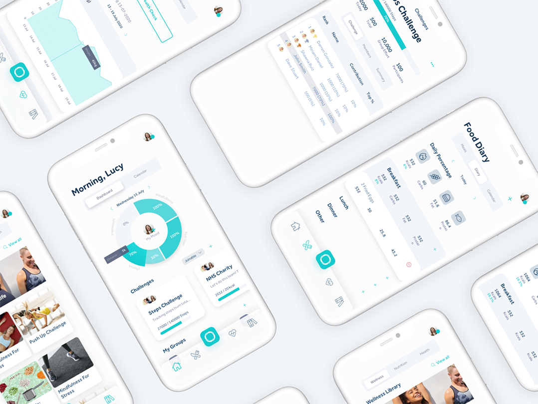
Web app redesign
The old web app had some strange navigation patterns, such as a concept of quick modules in the top navigation for accessing certain pages quickly. This would get cluttered quite quickly as users added more modules, and would not scale well. We drastically simplified the navigation by adding a fixed side menu with all the core app areas listed accordingly. We then set about reskinning the existing web app based on the newly developed design system we had for the mobile app, to address the inconsistencies spanning Hero’s various digital platforms.
04 / Development
Component based design approach
We used Sketch, Plant version control and Invision to build a high fidelity prototype that the client signed off, which was based on a new design system. We now needed to start implementing our design system and UI in actual software in order to build the application. We built out our entire design system as a component based library using React JS and Storybook, allowing us to build UI components in isolation so we could develop hard-to-reach states and edge cases before the rest of the frontend team got started on the integration stories. In our experience, the benefit of the component based approach reduces technical debt, allows for faster and higher-quality development and is a future-friendly foundation to build and iterate over for years to come.
04 / Development
API Improvements
The backend of the application, consisting of a REST API consumed by the mobile applications, was provided to us already partly written using the .NET framework. Our first goal was to review the existing code to determine the key points that needed improving / changing based on a number of factors:
- the new functionality requested to meet the rehaul of the mobile application;
- the stability and scalability of the platform; and
- the development and deployment processes.
04 / Development
We began by updating the development and deployment processes to use Docker and Docker Compose which would make any changes needed to accommodate the other points above much easier. By using Docker, we were able to containerise the application and move the application to use AWS Elastic Beanstalk which gave us the ability to quickly deploy and scale the application at will. These deployments were subsequently scripted using Continuous Deployment to ensure that we could develop at speed without having to worry about manual deployments. We also integrated Docker Compose into the project to ensure that it would be easy for any new developers working on the project to create their development environment and begin delivering value to the project as soon as possible. The review of the code identified a number of areas that needed improving in order to improve the performance of the application. We were able to analyse areas of the application that had not been optimised, and hence would struggle at scale, and devise solutions to improve the performance of the application in these areas. In one example, we were able to bring a process that previously required >45s to run down to below 1s. Finally, with the above improvements in place, we were able to work with the mobile development team to add to and improve the functionality of the API to ensure that the new functionality designed for the application could be achieved.
05 / Headlines
We successfully released the new mobile app with a bespoke global fitness challenge that invited 40,000 users from Vodafone’s global teams to join and take part using their wearables or phone health data. We delivered two versatile, fully whitelablled web and mobile app products in 2 months.
Next Case Study